How to Decor Around a TV Without Sacrificing Style in 2026
Decor Around a TV– I’ve worked with homeowners, renters, and small-space dwellers for years, and one complaint never…

Decor Around a TV– I’ve worked with homeowners, renters, and small-space dwellers for years, and one complaint never disappears:
“I hate how the TV ruins my living room.”
The truth? In 2026, the television itself is no longer the aesthetic enemy. Ultra-thin profiles, frame TVs, and matte screens have solved the hardware issue. What still trips people up is how they decorate around the TV.
It’s about integrating it into a cohesive, intentional interior—so your space feels elevated, balanced, and undeniably stylish.
If you care about design and functionality, this is your blueprint.
 Decor Around a TV
Table of Contents
Decor Around a TV
Before choosing shelves, art, or paneling, you must understand one principle I apply in every project:
The TV Is a Visual Anchor, Not a Focal Point
A focal point demands attention.
An anchor supports the composition.
In modern interiors, the TV should:
When decor around TV works, your eye scans the entire wall—not the black rectangle at its center.
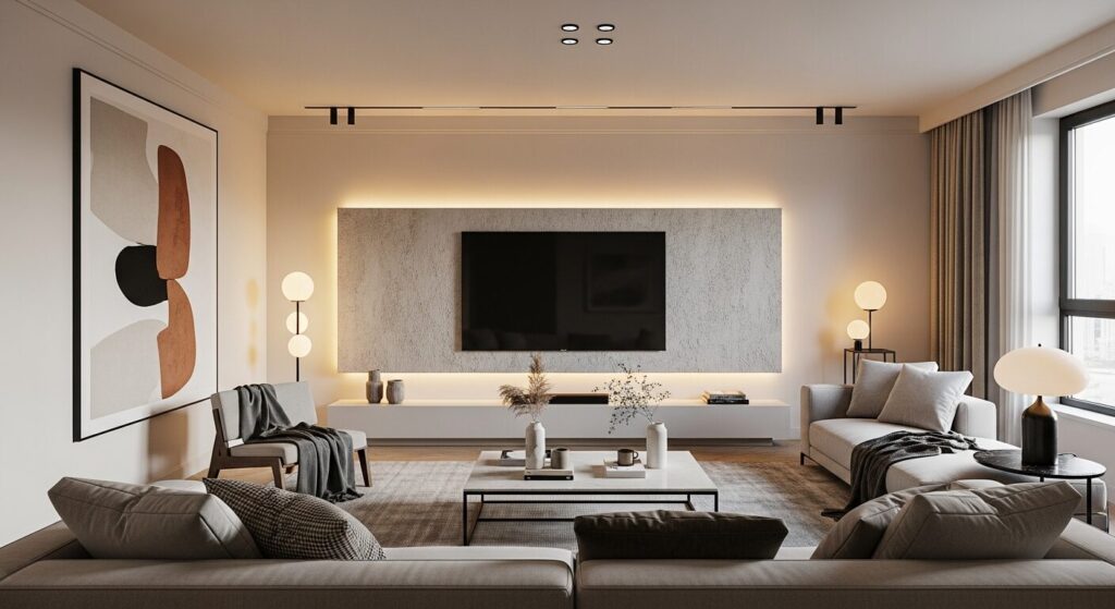
 Modern TV Wall Design Inspiration
POV: What I’ve Learned Designing TV Walls That Actually Age Well
From experience, the best TV walls in 2026 share three traits:
Every choice you make—paint color, shelf depth, spacing—should support those three ideas.
The 2026 Design Shift — From “TV Area” to “Media Composition”
 Built-In Media Wall Concept
The biggest shift I see this year is conceptual.
We no longer design around a TV.
We design media compositions.
That means:
This mindset alone elevates a room instantly.
Choosing the Right TV Placement (The Non-Negotiables)
Height Matters More Than Style
In 90% of homes, TVs are mounted too high.
Rule of Thumb (Expert Standard):
A well-styled TV wall fails if ergonomics are ignored.
Centered vs Asymmetrical Layouts
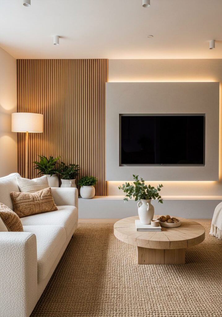
 Minimalist Decor Around a TV
| Layout Type | Best For | Visual Effect |
|---|---|---|
| Centered TV | Minimalist, modern | Calm, formal |
| Offset TV | Eclectic, creative | Dynamic, editorial |
Pro insight: Asymmetry feels intentional only when balanced by shelving or art mass.
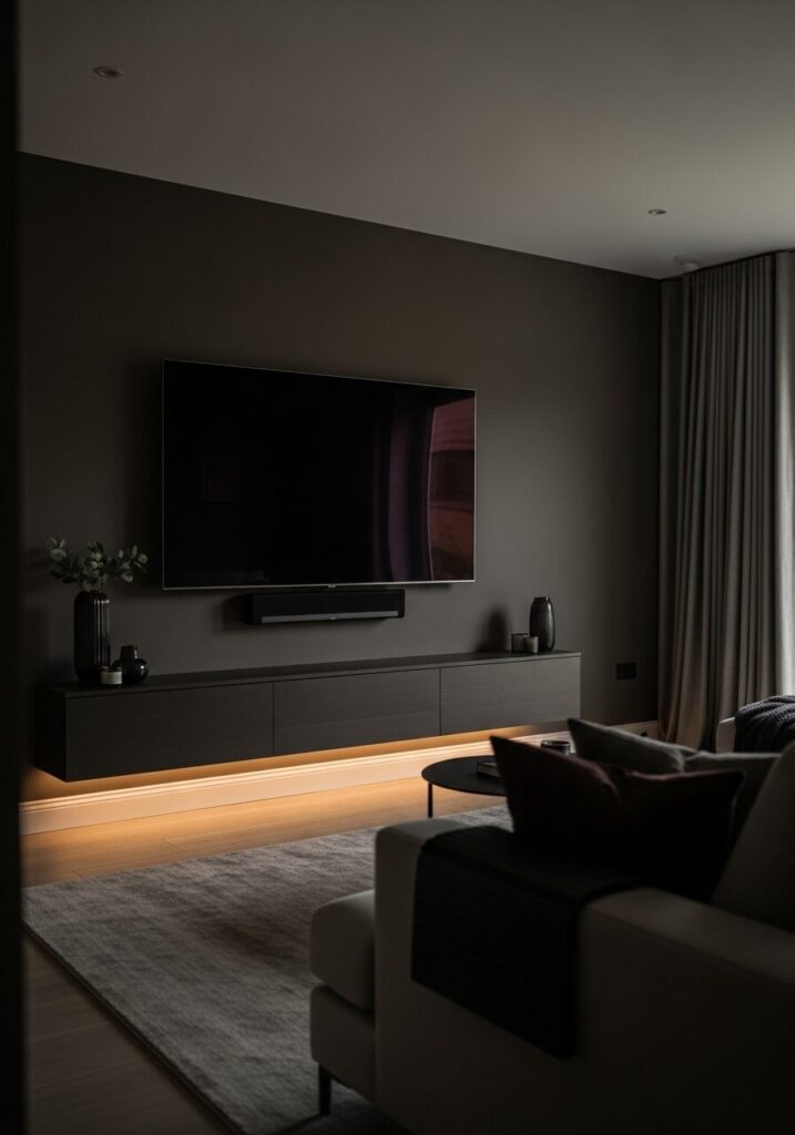
Color Strategy — How to Make the TV Visually Disappear
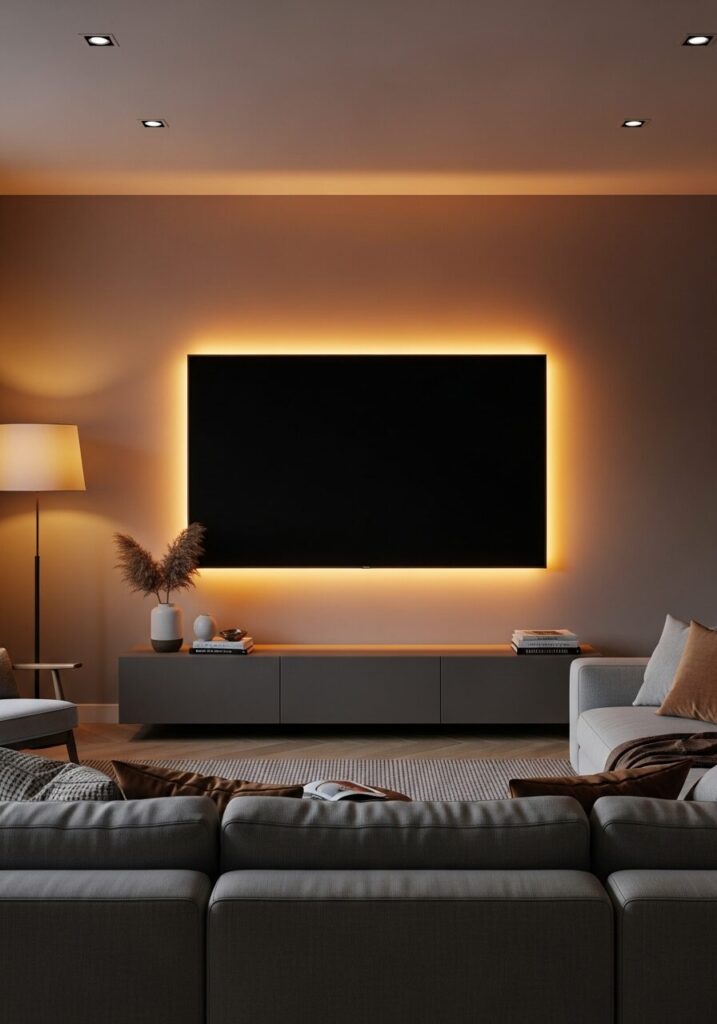
 Dark Accent Wall to Visually Hide the TV
Low-Contrast Walls Are Your Best Friend
I almost always recommend:
Dark TVs disappear beautifully against mid-to-deep tones.
Avoid High-Contrast White Walls
White walls amplify the TV’s black frame.
If white is unavoidable, introduce texture (limewash, slats, fabric panels).
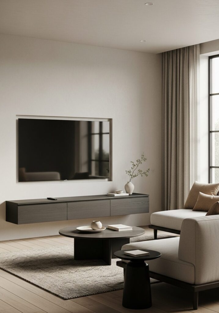
Built-Ins vs Floating Furniture
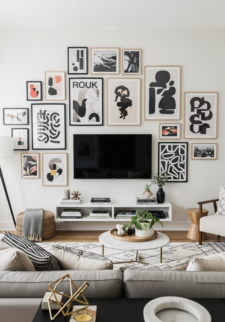 Gallery Wall Around a TV
When Built-Ins Make Sense
When Floating Media Consoles Win
Expert note: Floating consoles create negative space underneath, which visually lightens the TV wall.
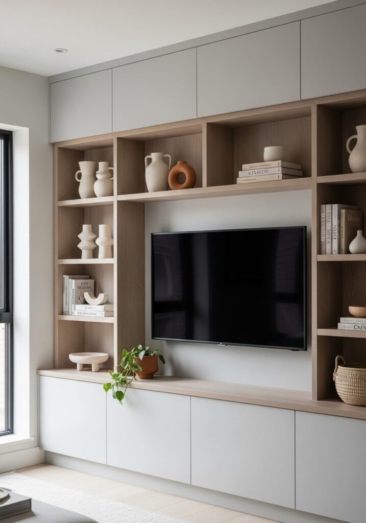
Shelving Around the TV
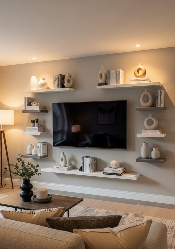 Shelving Styled Around the TV
The 60–30–10 Styling Ratio
I use this ratio constantly:
This prevents clutter while keeping warmth.
Shelf Spacing Rules
Art Around the TV
The “Visual Bracket” Technique
Instead of hanging art above the TV:
This reduces dominance and increases flow.
Texture Is the Secret Weapon of 2026
 Textured TV Wall (2026 Trend)
Flat walls feel dated.
Trending Textures:
Texture absorbs visual weight, softening the TV’s presence.
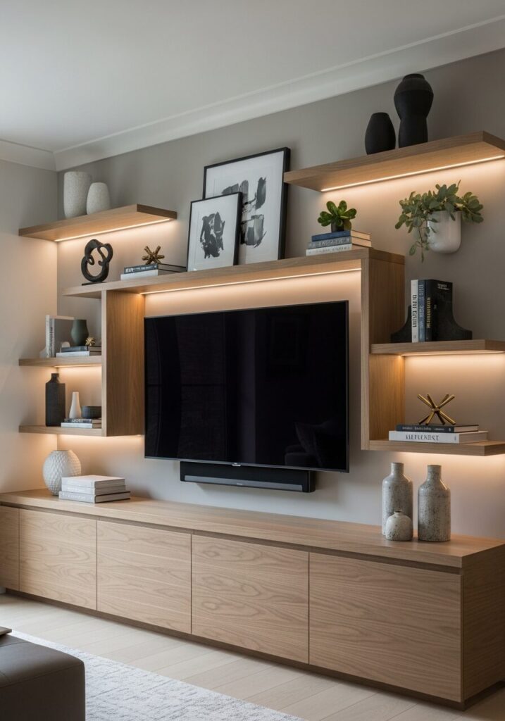
Lighting Around the TV
 TV Backlighting & Ambient Lighting
Backlighting Done Right
Accent Lighting Layers
Lighting should outline the composition, not spotlight the screen.
Styling the Media Console Like a Pro
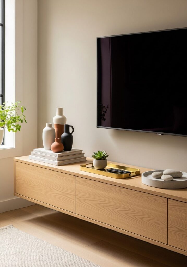 Floating Media Console Styling
What Belongs on the Console
What Never Belongs
Cable management is not optional—it’s design hygiene.
Step-by-Step Guide — Designing a Stylish TV Wall From Scratch
Editing is where style lives.
Common Mistakes That Instantly Cheapen a TV Wall
Avoid these, and you’re ahead of most homes.
Advanced Pro Tips I Use in High-End Projects
Decor Around a TV — Style Approach Comparison
| Style | Key Elements | Best For |
|---|---|---|
| Minimalist | Texture, negative space | Calm homes |
| Modern Organic | Wood, warm tones | Family spaces |
| Eclectic | Art clusters, mixed decor | Creative renters |
| Luxury | Stone, built-ins, lighting | Long-term homes |
Conclusion: Style Isn’t About Hiding the TV — It’s About Designing With Intention
In 2026, decorating around a TV is no longer about disguises or tricks. It’s about composition, restraint, and thoughtful layering.
When done well:
If you approach your TV wall like a designer—not a technician—you’ll never feel the need to “hide” it again.