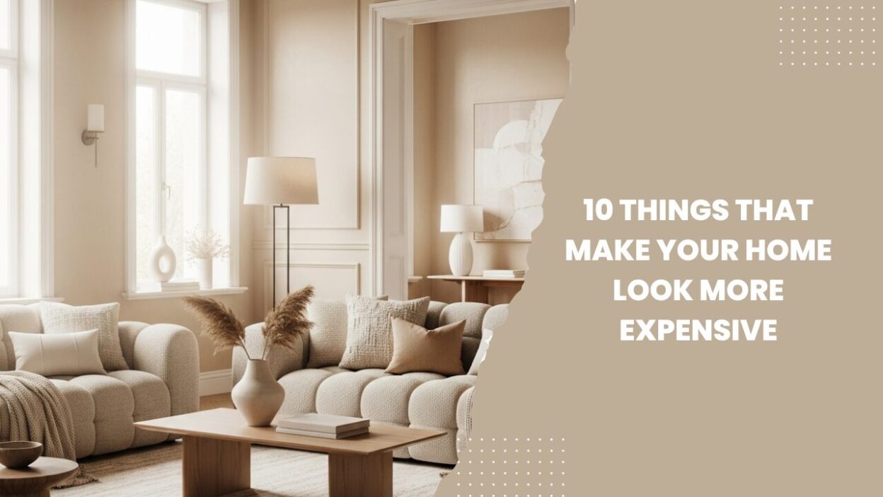
After years of working with homeowners, renters, and DIY renovators, I’ve learned one core truth: a home doesn’t look expensive because of how much you spend, it looks expensive because of how intentionally it’s designed.
Luxury interiors follow clear visual rules. They control proportion, material hierarchy, negative space, lighting quality, and consistency. When those fundamentals are right, even budget homes can feel curated, calm, and high-end.
I’ll break down 10 proven elements that instantly make your home look more expensive, whether you live in a rental apartment, a college studio, or a family home.
What Makes a Home Look More Expensive?
Before we dive into the list, understand this framework:
Luxury design = restraint + consistency + material intention
Expensive-looking homes share these traits:
- Fewer visual interruptions
- Thoughtful repetition
- Elevated textures
- Cohesive color stories
- Proper scale and alignment
Keep this lens in mind as we explore each factor.
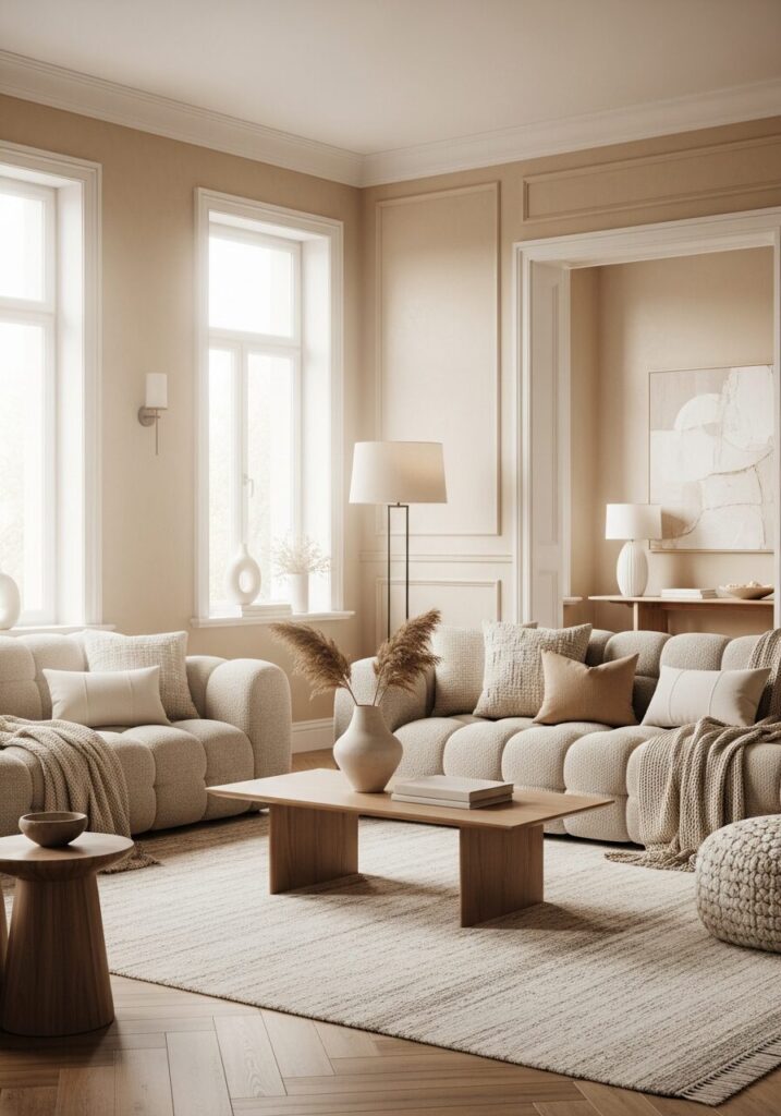
1. A Cohesive, Restrained Color Palette
(The Foundation of an Expensive Home)
Most budget homes fail visually because they use too many unrelated colors.
High-end interiors typically rely on:
- 1 primary neutral
- 1–2 supporting tones
- 1 subtle accent
Why This Works
Luxury brands and hotels use limited palettes because the brain associates consistency with intention.
Expert Application
- Walls, trim, furniture, and textiles should belong to the same tonal family.
- Neutrals don’t mean boring, think warm whites, greige, mushroom, stone, and soft taupe.
2. Floor-Length Curtains Hung High
(One of the Biggest Visual Upgrades You Can Make)
I consider this the fastest way to make a home look expensive.
The Rule
- Hang curtains 2–4 inches below the ceiling
- Curtains should touch the floor or barely puddle
- Avoid short or mid-window curtains at all costs
Why It Works
It visually:
- Raises ceiling height
- Frames windows like architecture
- Adds softness and vertical drama
Pro Tip
Even budget curtains look luxurious when they’re:
- Steamed
- Properly hung
- Neutral in color
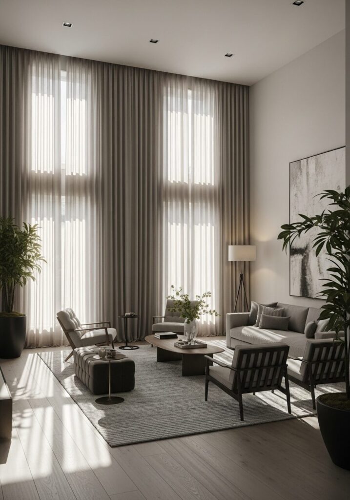
3. Thoughtful, Layered Lighting
Expensive homes never rely on a single overhead light.
The 3-Layer Lighting Formula
- Ambient (ceiling or general)
- Task (reading, kitchen prep)
- Accent (lamps, sconces, LEDs)
Why This Matters
Lighting controls mood, and mood signals luxury.
Practical Example
Instead of:
- One bright white ceiling bulb
Use:
- Warm overhead light
- Table lamp near seating
- Floor lamp in corners
4. Fewer, Larger Decor Pieces (Not Many Small Ones)
One of the most common mistakes I see is over-accessorizing.
Luxury Rule
One large, intentional piece beats five small random ones.
Examples
- One oversized art print instead of a gallery of tiny frames
- One sculptural vase instead of multiple knickknacks
Why This Works
Large-scale decor:
- Feels confident
- Reduces visual clutter
- Mimics gallery and hotel styling
5. High-Quality Hardware & Fixtures
(Small Details, Massive Impact)
You don’t need new cabinets, you need better hardware.
Upgrade Targets
- Cabinet pulls
- Door handles
- Faucet finishes
- Light switches
Best Finishes for an Expensive Look
- Brushed brass
- Matte black
- Soft champagne gold
Why This Works
Metal finishes signal craftsmanship and permanence.
6. Consistent Flooring (or the Illusion of It)
Mismatched flooring instantly lowers perceived value.
Professional Trick
If replacing floors isn’t possible:
- Use large rugs to create continuity
- Choose similar tones across rooms
Rug Rule
- Bigger is always better
- Furniture legs should sit on the rug
7. Decluttered, Styled Surfaces
(Luxury Is Calm, Not Crowded)
Expensive homes feel edited, not empty.
The Styling Formula
- Group items in odd numbers (3 or 5)
- Mix heights and textures
- Leave negative space
Real-World Example
A coffee table styled with:
- One book stack
- One sculptural object
- One organic element
8. Proper Furniture Scale and Layout
Furniture that’s too small makes a room feel cheap, even if it wasn’t.
Designer Insight
Luxury homes favor:
- Deep sofas
- Wide armchairs
- Fewer but larger pieces
Layout Tip
Float furniture away from walls to create intentional zones.
9. Textures That Invite Touch
(Visual Luxury Is Also Tactile)
Expensive spaces layer textures subtly.
High-End Texture Mix
- Linen
- Wool
- Wood
- Stone
- Ceramics
Avoid shiny synthetics where possible.
10. Intentional Negative Space
(The Most Overlooked Luxury Element)
What you don’t add matters just as much.
Why Negative Space Signals Luxury
- Suggests confidence
- Avoids visual stress
- Mirrors gallery design
If every corner is filled, the room feels anxious—not expensive.
Cheap vs Expensive Visual Signals
| Element | Budget Look | Expensive Look |
|---|---|---|
| Curtains | Short, thin | Floor-length, full |
| Lighting | Single overhead | Layered, warm |
| Decor | Many small items | Few large pieces |
| Color | Random | Cohesive |
| Furniture | Undersized | Proper scale |
Step-by-Step: Making Your Home Look More Expensive on a Budget
- Declutter every visible surface
- Choose one neutral palette
- Upgrade lighting temperature
- Hang curtains correctly
- Replace visible hardware
- Add one oversized decor piece per room
- Invest in a large rug
Common Mistakes to Avoid
- Mixing too many decor styles
- Ignoring lighting color temperature
- Buying trendy decor without scale awareness
- Hanging art too high
- Overfilling shelves
Pro Tips from Experience
- Steam your curtains, wrinkles kill luxury
- Repeat finishes across rooms
- Invest where eyes rest longest (living room, bedroom)
- Photograph your room, flaws become obvious
Conclusion: Luxury Is Intentional Design, Not Spending
If there’s one takeaway from this guide, it’s this:
An expensive-looking home is the result of editing, consistency, and thoughtful choices, not 100% a big budget.
By applying these ten principles, you can transform your space into something that feels elevated, calm, and enduring, regardless of square footage or cost.
If you want your home to look more expensive, start by designing it like it matters.
And it will show.