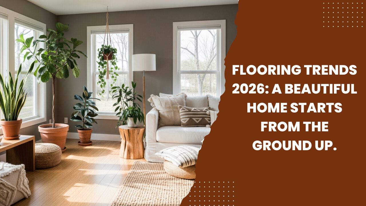
20 Coffee Table Styling Ideas You’ll Want to Copy
I’ve styled hundreds of living rooms over the past decade—from compact college apartments to high-end family homes—and if…

I’ve styled hundreds of living rooms over the past decade—from compact college apartments to high-end family homes—and if there’s one surface that quietly defines the entire space, it’s the coffee table.
Your coffee table is not just furniture. It’s a visual anchor, a lifestyle signal, and often the first place the eye lands when someone walks into the room. When styled intentionally, it can elevate even the most basic sofa setup. When neglected, it can make an otherwise beautiful space feel unfinished.
I’m sharing 20 coffee table styling ideas you’ll genuinely want to copy—because they’re grounded in real-world use, professional design logic, and proven visual frameworks, not fleeting trends.
This isn’t about clutter or perfection. It’s about balance, proportion, and personality—done in a way that works for real homes, real families, and real budgets.
Table of Contents
Coffee Table Styling Ideas Fundamentals
Before we dive into specific ideas, let’s establish the core framework I use in every project.
The 3-Object Styling Formula (Industry Standard)
At its simplest, coffee table styling works best in groups of three:
This formula prevents flat, lifeless tables and creates instant visual hierarchy.
Key Design Principles I Follow
1. The Classic Tray Foundation (My Go-To Starting Point)
A decorative tray instantly organizes your coffee table and prevents visual chaos.
Why it works
What I recommend
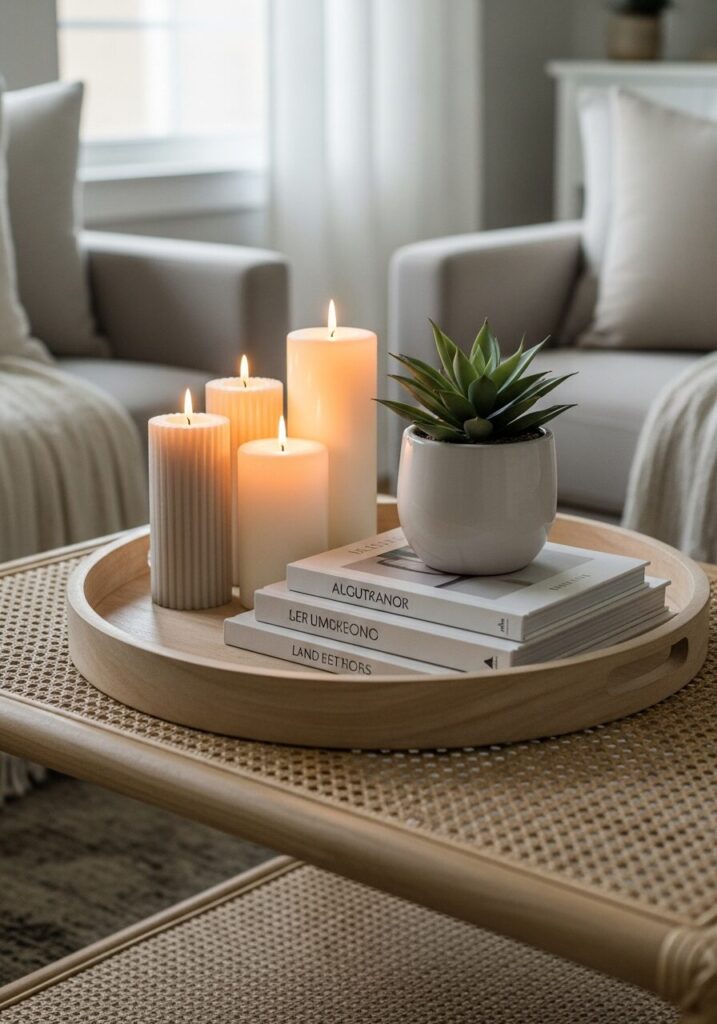 The Classic Tray Foundation
2. Stacked Coffee Table Books (The Designer Shortcut)
Books add height, color, and intellectual texture.
Pro Styling Formula
Add a small object on top (beads, coral, candle) to finish the stack.
Expert Insight: I often choose books that subtly reflect the homeowner’s interests—travel, art, architecture—this boosts authenticity.
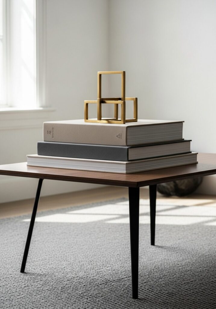 Stacked Coffee Table Books
3. The Single Statement Vase Rule
Sometimes, one bold object is stronger than five small ones.
Best Use Cases
Choose a sculptural vase and let it breathe.
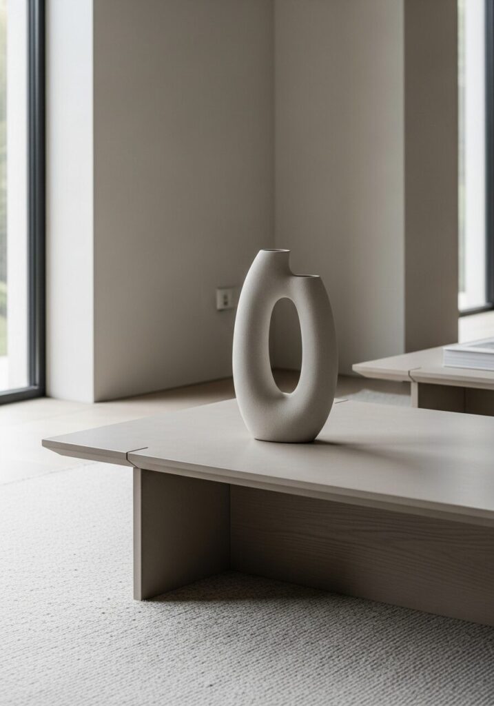 The Single Statement Vase Rule
4. Greenery That Doesn’t Feel Fake
Plants soften hard lines and add life—but only if scaled correctly.
Best Coffee Table Plants
Mistake to avoid: Tall plants that block sightlines.
5. Candles as Visual Anchors
Candles create mood even when unlit.
Pro Tip
Use different heights but the same color palette.
6. Sculptural Objects That Start Conversations
Abstract objects add personality without clutter.
What Works Best
I often use these to introduce subtle contrast.
7. The “Personal Story” Layer
This is where most Pinterest rooms fail—they forget the human element.
Examples
Rule: One personal item per table is enough.
8. Seasonal Styling (Without Buying New Decor)
I rotate only one element per season.
| Season | Swap This | Result |
|---|---|---|
| Spring | Florals | Fresh & airy |
| Summer | Coastal object | Light & relaxed |
| Fall | Textured bowl | Warm & grounded |
| Winter | Metallic candle | Cozy & festive |
9. Round Table Styling (Special Rules Apply)
Round tables need radial balance, not symmetry.
My Formula
Avoid square trays—they fight the shape.
10. Rectangular Table Styling (Designer Favorite)
Rectangular tables allow linear storytelling.
Layout Options
This is ideal for family rooms.
11. Glass Coffee Table Styling (Less Is More)
Transparency magnifies clutter.
Pro Rule
Limit to 3–4 items max and prioritize texture.
12. Small Apartment Coffee Table Solutions
When space is tight, styling must multitask.
Smart Choices
13. Family-Friendly Styling
I design for kids and still keep things beautiful.
What I Avoid
Choose durable decor that looks intentional.
14. Layering Textures Like a Pro
Texture creates richness without adding clutter.
Texture Mix Formula
15. Neutral-on-Neutral Styling
Neutral doesn’t mean boring.
Elevate It With
16. Black Coffee Tables: Styling Without Harshness
Black surfaces need contrast.
Best Pairings
17. Rustic Coffee Table Styling
Lean into imperfection.
18. Modern Minimalist Coffee Tables
Focus on form, not quantity.
Two objects, perfectly chosen, beat five average ones.
19. Luxury-Inspired Styling (On a Budget)
Luxury is about restraint.
What I Use
20. The “Reset in 60 Seconds” Method
My personal trick when a table feels off:
Common Coffee Table Styling Mistakes to Avoid
Pro Tips From My Client Projects
Conclusion: Style With Intention, Not Imitation
The best coffee table styling ideas aren’t copied blindly—they’re adapted thoughtfully.
When you understand the principles behind proportion, texture, and storytelling, styling becomes intuitive, not intimidating. Start with fewer pieces, trust negative space, and let your coffee table reflect how you actually live—not just how you want it photographed.